Como as cores dos têxteis influenciam a perceção dos interiores de um hotel?
Descubra a psicologia da cor nos hotéis. Veja como os têxteis nas tonalidades certas influenciam o conforto, o ambiente e a perceção do hóspede.
Como as cores dos têxteis influenciam a perceção dos interiores de um hotel?
Num hotel de luxo, nada é deixado ao acaso – cada material, aroma e cor contribui para a forma como o hóspede sente o espaço. Os têxteis desempenham um papel fundamental: toalhas, roupa de cama, roupões e cortinas criam a primeira impressão, definem o ambiente e despertam emoções.
Neste artigo, mostramos-lhe como escolher conscientemente as cores dos têxteis para que combinem com o estilo do espaço e reforcem a identidade da sua marca hoteleira.
1. Cor é emoção – psicologia da cor no hotel
As cores despertam sensações específicas – mesmo que o hóspede não perceba de forma consciente:
-
Branco – pureza, frescura, minimalismo. Uma escolha segura para hotéis clássicos e boutique.
-
Bege e tons areia – conforto, naturalidade, harmonia. Perfeitos para alojamentos slow-travel, SPA ou eco-luxo.
-
Azul-marinho, cinzento escuro, taupe – elegância, profundidade, profissionalismo. Ideais para hotéis de negócios modernos.
-
Verde-oliva, verde-sálvia – relaxamento, ligação à natureza. Excelentes para espaços fora da cidade ou com vegetação.
-
Azul pastel e lavanda – tranquilidade, frescura. Ideais para quartos e zonas de bem-estar.
A Ormire oferece têxteis com paletas desenvolvidas especificamente para interiores de hotéis e apartamentos.
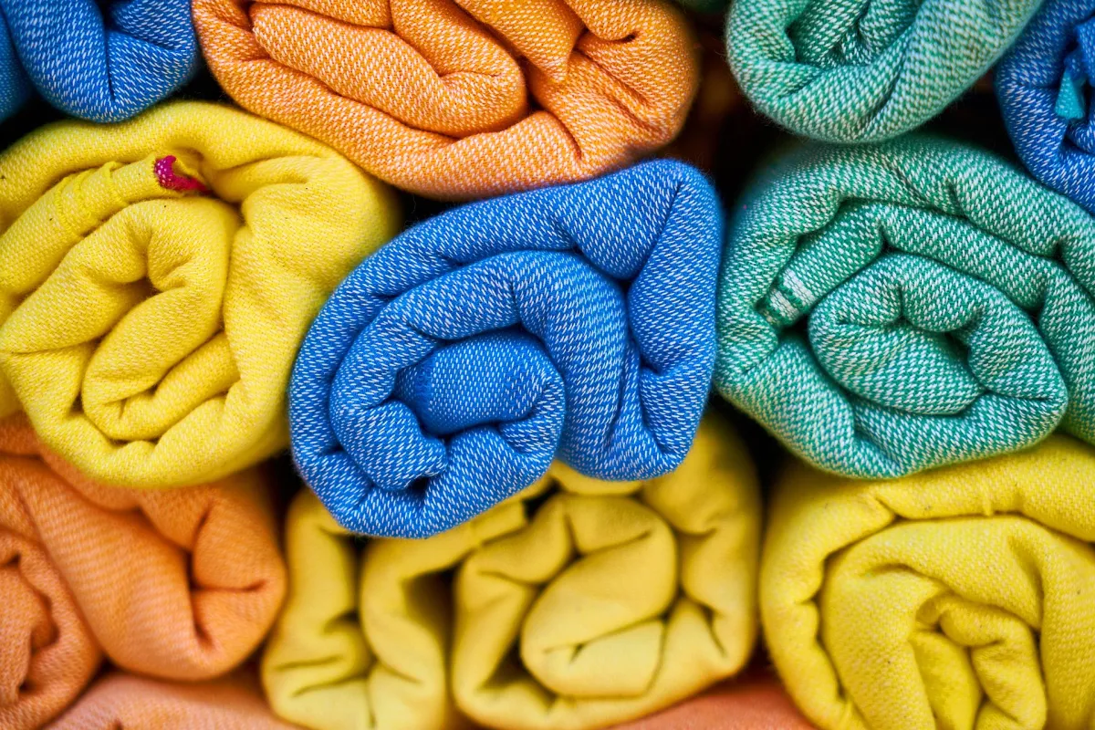
2. Os têxteis como principais transmissores de cor
Enquanto paredes e mobiliário são muitas vezes neutros, os têxteis introduzem cor e emoção:
-
A roupa de cama define o tom – branco para simplicidade, creme para suavidade, azul profundo para sofisticação.
-
As toalhas são ponto de contacto direto – a cor deve evocar limpeza, frescura e estilo.
-
Roupões e chinelos podem refletir a identidade cromática da marca – uma forma subtil de branding.
-
Cortinas, mantas e almofadas decorativas complementam a paleta e devem estar em harmonia com o ambiente.
3. Cores segundo o tipo de hóspede e estilo do alojamento
????️ Hotel urbano / de negócios:
Tons neutros – cinzentos, azul-marinho, branco com toques de preto ou cromado. O hóspede procura tranquilidade e profissionalismo.
????️ Hotel boutique no centro:
Paleta suave mas distinta – bege areia, rosa velho, taupe. Um look “urban calm” com estilo.
???? Apartamento familiar ou de aluguer turístico:
Cores naturais e suaves – algodão claro, azul pastel, verde menta – criam sensação de conforto e bem-estar.
???? SPA ou centro de bem-estar:
Verdes, brancos, tons terrosos como argila e ocre – paleta relaxante e com ligação à natureza.
4. Como escolher cores alinhadas com a marca?
✔ Crie uma paleta de 2 a 3 cores principais a aplicar em todo o espaço (têxteis, identidade visual, decoração)
✔ Adapte as cores à estação – tons claros no verão, mais profundos no inverno
✔ Evite o “branco hoteleiro aborrecido” – exceto se fizer parte da sua filosofia minimalista
✔ Trabalhe com fornecedores que personalizam cores para a sua marca – como Ormire Custom Hotel Palettes
5. As cores influenciam as avaliações dos hóspedes? Sim.
«A roupa de cama tinha um tom quente e acolhedor – senti-me em casa.»
«Tudo estava harmonizado – das cortinas ao roupão.»
«Decoração minimalista, mas os têxteis deram vida e sofisticação.»
A cor é uma linguagem silenciosa que comunica qualidade.
Resumo
Na Ormire acreditamos que a cor transmite emoções – e as emoções criam memórias duradouras. Ao escolher os têxteis certos, pode transformar a perceção do espaço, refletir os valores da sua marca e causar uma impressão que vai muito além da estadia.
Descubra os têxteis Ormire nas cores da sua marca – «Essentials that make the stay.»
 Polonês
 Inglês
 Tcheco
 Alemão
 Espanhol
 Francês
 Italiano
 Norueguês
 Eslovaco